
This page contains examples of data visualization projects that The Galecia Group has worked on recently.
- Regional Library Materials Distribution, % of Checkouts Leaving Jurisdiction
- California Public Libraries, Total Operating Expenditure Per Capita
- Illinois Public Libraries, Revenue Per Capita, Geographic Distribution
- Simple Revenue Comparison Chart of Local Libraries
- Hex Map Example, Library Outlet Density, Western United States
- Georeferenced Historical Maps - 1893 Chicago vs 2015 Chicago
- US Libraries by Legal Basis (Jurisdiction) Code, 2017
Visualization: Regional Library Materials Distribution
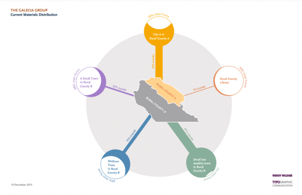
We conducted an analysis of library circulation data for several libraries in a regional cooperative to determine the percentage of material checkouts that were within vs. outside of each library's respective jurisdiction. A number of maps were produced, but this (genericized) data visualization starkly illustrates the difference in each library's circulation characteristics.
Visualization: California Public Libraries, Total Operating Expenditure Per Capita
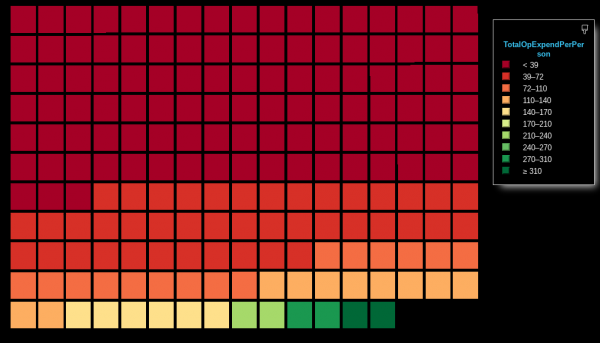
Each square represents one California public library system. The libraries are sorted in order of their per capita total operating expenditure (per 2017 IMLS data). Each color gradation represents a $30/capita range of TOpEx. As you can see, most libraries spend under $39.00/person/year on operating expenses. A small number of libraries spend significantly more per person, ranging up to the maximum: libraries spending almost ten times the per capita expenditure as the bottom of the range.
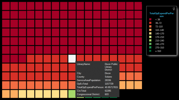
The image below shows the interactivity of the visualization, with a particular library record (Dixon Public Library) and its budget information displayed. (This novel visualization was created with the "Sand Dance" visualization tool using IMLS 2017 data.)
Visualization: Illinois Public Libraries, Revenue Per Capita, Geographic Distribution
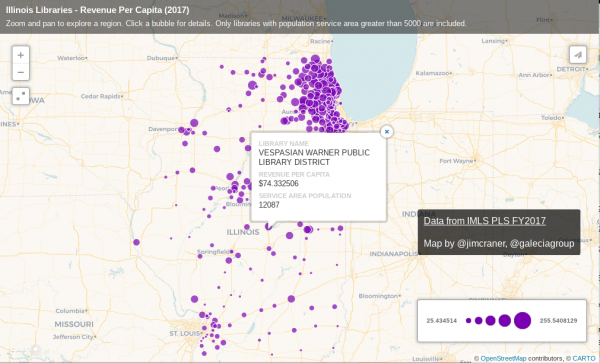
This interactive visualization shows the distribution of public libraries in Illinois, with each library's marker sized proportionally to the library's total revenue per capita. Users can zoom into a specific region to visually compare libraries and quickly identify relative funding levels. Additional metrics can be added to the visualization to illustrate circulation statistics, budget breakdown, staff composition and more.
This visualization was created using Carto's GIS software and IMLS 2017 data.
Visualization: Simple Revenue Comparison Chart of Local Libraries
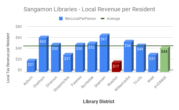
Sometimes the simplest visualization tools tell the clearest story. This simple bar chart - created for the library district highlighted in red - illustrates the per capita revenue of each library in a specific county, along with the county average. Visualizations can help decision-makers and stakeholders better interpret data as well as convince others when demonstrating the library's impact in the community. A future iteration of this project should be able to automatically generate these county-specific reports for each library in the United States.
Visualization: Hex Map Example, Library Outlet Density, Western United States
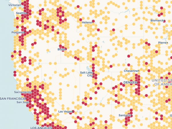
This innovative map visualization uses Carto's "hex map" feature to illustrate the geographic density of public library outlets - branches and bookmobiles - in the western United States. This map style provides a more precise alternative to the "heat map" style of geographic density visualization which is more common.
Visualization: Georeferenced Historical Maps - 1893 Chicago vs 2015 Chicago
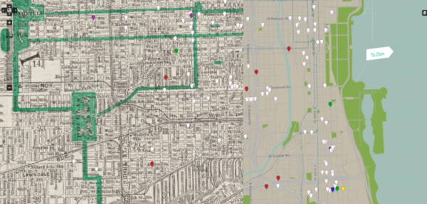
These maps were created to supplement a digital history project for The Newberry Library in Chicago. We first created a custom map background of modern Chicago using open data from the OpenStreetMap project and the US Census Bureau. We then obtained a high-quality scan of a historical map from a map catalog at Harvard University, and "georeferenced" it to the modern city map (using open source QGIS software). This turned the original image into an actual digital background map layer, allowing visitors to toggle between the historical street map and the modern grid.
Visualization: US Libraries by Legal Basis (Jurisdiction) Code, 2017
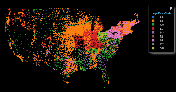
This visualization illustrates the legal basis code (roughly corresponding to jurisdiction) for US libraries: City/County, City, County, Library District, Multi-Jurisdictional, etc. You can see trends, such as the independent library district model common throughout the Ohio River Valley, or the preponderance of nonprofit-organized library systems throughout New England, New York, and Pennsylvania.
Because this graphic was created with the "Sand Dance" data visualization tool, it's easy to switch "views" to a more traditional data format to get a different perspective on the jurisdictional types.